Intro to Taylor Glacier Science
October 2003 to December 2003
As humans do more to disturb the natural climate system, it is becoming more important for scientists and policymakers to understand the natural system's inherent variability and what feedbacks may exist that could amplify changes that humans make to the atmosphere, oceans, and land surface. One of the best ways to look at what the climate system is capable of is to look at the record of past climate that is contained in proxy records such as ice cores, sediment cores, and the chemical composition of corals. The best time resolution for the interval from 100,000 years ago to the present is provided by ice cores.
The ice of Greenland, Antarctica, and a few other glaciers around the world has provided a telling picture of the variations that are possible. The glacial-interglacial temperature difference has been inferred to be 15 oC from isotope and borehole temperature data taken at the Greenland Ice Sheet Project II ice core site. Very rapid climate changes have also been observed, such as the Younger Dryas event, in which temperatures dropped almost to the level of the last glacial period. It is thought that the thermohaline circulation of the North Atlantic Ocean plays a significant role in these changes. Density gradients in the seawater drive the circulation. The name of the circulation alludes to the fact that the density of seawater depends on the temperature and salinity of the water. Because these two variables can change somewhat independantly, the circulation has more than one semi-stable configuration, with different states separated by tipping points. If the climate were to pass one of these "tipping points" in the present day, the implications in terms of human lives affected and monetary losses would be immense. To really explain how the thermohaline circulation works would take pages, so if you're interested look elsewhere. I haven't been able to find a good reference on the web.
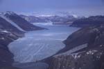
An important part of the climate system that we need to understand is the glaciers themselves. One glacier in particular, the Taylor Glacier in Antarctica, has a unique potential for informing the way that we think about how Antarctic glaciers have responded to past climate changes. An ice core was drilled at the source of the glacier, at Taylor Dome, in the mid 1990's, providing a local record of the variations in isotopes of water that can provide information about past temperatures at the glacier and at the water vapor source region. Chemical impurities in the ice can provide information about the source and transport of the water vapor. Atmospheric trace gases, such as methane, trapped in bubbles in the ice can provide other information about the climate. Since the Taylor glacier terminates on land, rather than flowing out into the ocean like many other Antarctic glaciers, we have information about past glacier terminus positions from a series of moraines. Another reason to study the Taylor Glacier is the interesting biology that exists in the "dry" valley below the terminus of the glacier. A Long Term Ecological Research Group has been researching in the valley for a number of years, and they will be interested in the results from our work.
The main goal of the Taylor Glacier project is to write a computer model that describes how the glacier flows. We will use the data we collected from GPS surveying, radar surveying, ablation stake monitoring, and surface isotope sampling in conjunction with data from the Taylor Dome ice core and from the moraines to tune and check the model. The local climatic temperature affects the ice flow part of the glacier model, since ice viscosity has an exponential dependence on temperature. One component of the glacier model is a mass balance model. For the accumulation part of the mass balance, we will use the accumulation record from the ice core to come up with a reasonable mathematical representation of the accumulation on the glacier. The ablation part of the mass balance model will be more complex due to variations in the relevant forcing parameters (such as incoming radiation, temperature, and wind speed) over short distance scales. In order to get information about the local climatic temperature and to understand the spatial variability of weather parameters across the glacier, in the austral summer of 2003-4, we set up a network of Campbell Scientific weather stations on the Taylor Glacier.
First camp (2.5 Mb). Here's a movie of the data from the Davis weather stations I set up in 2002 close to our first camp. The background image is a good DEM derived from Lidar data. Unfortunately, we only have the good DEM for this set of stations and not the ones higher up on the glacier.
Taylor clip (21 Mb). Here is a clip from the most recent version of my movie. It shows the data from a storm that occured during the first few days of December 2003. The data comes from the network of five Campbell weather stations that we set up in the middle of November. The background is a declassified satellite image draped over a DEM created from the image. The fastest wind speed shown, which is an average over the 20 minute recording interval, was about 28 m/s (63 mph).
While learning how to make these "coneplots" I accidentally created a porcupine and a colored porcupine.
The ice of Greenland, Antarctica, and a few other glaciers around the world has provided a telling picture of the variations that are possible. The glacial-interglacial temperature difference has been inferred to be 15 oC from isotope and borehole temperature data taken at the Greenland Ice Sheet Project II ice core site. Very rapid climate changes have also been observed, such as the Younger Dryas event, in which temperatures dropped almost to the level of the last glacial period. It is thought that the thermohaline circulation of the North Atlantic Ocean plays a significant role in these changes. Density gradients in the seawater drive the circulation. The name of the circulation alludes to the fact that the density of seawater depends on the temperature and salinity of the water. Because these two variables can change somewhat independantly, the circulation has more than one semi-stable configuration, with different states separated by tipping points. If the climate were to pass one of these "tipping points" in the present day, the implications in terms of human lives affected and monetary losses would be immense. To really explain how the thermohaline circulation works would take pages, so if you're interested look elsewhere. I haven't been able to find a good reference on the web.
An important part of the climate system that we need to understand is the glaciers themselves. One glacier in particular, the Taylor Glacier in Antarctica, has a unique potential for informing the way that we think about how Antarctic glaciers have responded to past climate changes. An ice core was drilled at the source of the glacier, at Taylor Dome, in the mid 1990's, providing a local record of the variations in isotopes of water that can provide information about past temperatures at the glacier and at the water vapor source region. Chemical impurities in the ice can provide information about the source and transport of the water vapor. Atmospheric trace gases, such as methane, trapped in bubbles in the ice can provide other information about the climate. Since the Taylor glacier terminates on land, rather than flowing out into the ocean like many other Antarctic glaciers, we have information about past glacier terminus positions from a series of moraines. Another reason to study the Taylor Glacier is the interesting biology that exists in the "dry" valley below the terminus of the glacier. A Long Term Ecological Research Group has been researching in the valley for a number of years, and they will be interested in the results from our work.
The main goal of the Taylor Glacier project is to write a computer model that describes how the glacier flows. We will use the data we collected from GPS surveying, radar surveying, ablation stake monitoring, and surface isotope sampling in conjunction with data from the Taylor Dome ice core and from the moraines to tune and check the model. The local climatic temperature affects the ice flow part of the glacier model, since ice viscosity has an exponential dependence on temperature. One component of the glacier model is a mass balance model. For the accumulation part of the mass balance, we will use the accumulation record from the ice core to come up with a reasonable mathematical representation of the accumulation on the glacier. The ablation part of the mass balance model will be more complex due to variations in the relevant forcing parameters (such as incoming radiation, temperature, and wind speed) over short distance scales. In order to get information about the local climatic temperature and to understand the spatial variability of weather parameters across the glacier, in the austral summer of 2003-4, we set up a network of Campbell Scientific weather stations on the Taylor Glacier.
Field Projects
GPS Surveying
The main purpose of the GPS surveying is to get ice velocities at various points on the glacier. The points we chose are the green dots on this map. A typical survey station (each green dot) looks like this. At each site we left the metal pole that the antenna rests on in the ice for posterity. The GPS measures the position of each pole that we set up and then by taking a second measurement of the position at a later time, we can get a velocity. We did the first measurements last season and the second measurements this season. We are interested in both horizontal and vertical velocities. The horizontal velocities in conjunction with the radar depth data tell us how much ice is moving past the point. The vertical velocities, if the downslope component of motion can be accurately removed, are a proxy for long-term ablation rates. The calculation of the long-term ablation rate is pretty simple glacier physics but I won't go into it here.
Radar Surveying
Twit and Dave did a number of traverses of the glacier with their radar system. The traverse lines corresponded with groups of more than four GPS measurements (the green dots). The radar set up looks like this from a distance. Excerpted from that picture's caption: Measuring the time it takes for a radar signal to go from the transmitter down to a natural reflector in the ice (the ice/bedrock contact is often the strongest reflector) and then back to the receiving antenna enables an estimate of the distance from the surface to the reflector. This data is useful to us because it tells us how deep the ice is. The GPS measurements of surface velocity and the radar measurments of ice depth, along with some assumptions about the nature of the ice flow allow a calculation of the volume of ice that moves past any point on the glacier.Ablation Stake Monitoring
The term ablation is used to describe the total mass lost from a glacier. Mass can be lost through: melting at the surface or at the bed, evaporation of ice from the surface, or calving. Calving is not important for the Taylor Glacier because it terminates on land (Lake Bonney is not large enough to cause significant calving). To find out how much ice was lost to melting and evaporation, we measured the height of each GPS pole every time we visited it. From last summer to this summer some locations lost more than 30 cm of ice.Surface Isotope Sampling
Another thing we did was to take samples of ice from the glacier. The samples were melted in the lab and analyzed to find the isotopic composition of the water. The reason to do this is to try to get the age of the ice at the sample locations. Unlike with radioactive isotopes that decay at known rates, simply finding the concentrations of the various stable isotopes of water will not give an age directly. But since we expect the ice at the surface of the glacier to get older as it gets closer to the terminus and since we expect the ice at Taylor Dome to get older as it gets closer to the bed of the glacier, we can match up the isotopes from the surface ice with the isotopes of the ice from deep within the Taylor Dome ice core. Then since the flow of ice at the Dome is simple, we can use a model to predict how old ice at a certain depth should be and presto we get the age of the ice at the surface too. I wrote that and it makes sense to me, but it probably doesn't make sense to you...let me know.Weather Stations
For the 2002-3 season, we didn't plan ahead far enough to have a working Campbell Scientific weather station on hand. The Crary Lab did have some small weather stations on hand though, so we set them up next to each of our camps. The weather stations were made by a company called Davis and their locations are labelled with blue triangles on the map. For the 2003-4 season, we had 5 Campbell Scientific weather stations with the capability to relay their data back to us via satellite. They are labelled with red squares on the map. You'll notice that there are 8 red squares on the map. The station closest to the terminus of the glacier (closest to the right side of the map) is run by the LTER group. Moving up glacier (left) from the terminus the next two squares represent one station that I helped set up in mid-November but then the remaining crew moved it at the beginning of January. The southernmost station (south is down) was added at the end of the season to try and capture the fastest winds possible coming out of Windy Gully. The other four red squares represent the other four stations I helped set up in mid-November. Here is a picture of a weather station. The caption describes what the station measures.Weather Station Movies
The first step in analyzing the weather station data is to look at the data. The easiest way to do that is to plot the various varibles like wind speed or temperature versus time. It is easy to put all the stations on the same plot. However, if I put all the stations' data for multiple variables on the same plot to see if they changed in sync, it is too confusing. So I came up with a way to animate the data so it is easier to see what is going on and see how the wind speeds and directions relate to the topography of the area. In Antarctica a large portion of the wind is gravity-driven (cold, dense air is pulled downhill by gravity and replaced by less dense air). Thus, these winds are more sensitive to local topography than winds in other places. I've now made a series of animations such as the ones below. Each cone in the animation represents a weather station. The length of the cone is proportional to the wind speed and the orientation of the cone corresponds to the wind direction. The color of the cone depends on the temperature measured at the station (the colorbar is in degrees Celsius).First camp (2.5 Mb). Here's a movie of the data from the Davis weather stations I set up in 2002 close to our first camp. The background image is a good DEM derived from Lidar data. Unfortunately, we only have the good DEM for this set of stations and not the ones higher up on the glacier.
Taylor clip (21 Mb). Here is a clip from the most recent version of my movie. It shows the data from a storm that occured during the first few days of December 2003. The data comes from the network of five Campbell weather stations that we set up in the middle of November. The background is a declassified satellite image draped over a DEM created from the image. The fastest wind speed shown, which is an average over the 20 minute recording interval, was about 28 m/s (63 mph).
While learning how to make these "coneplots" I accidentally created a porcupine and a colored porcupine.